Project Overview
The betting industry is notorious for users' jumping between multiple apps, but conversion rates were generally high, so a low number was worrying. After the initial launch and success of the SBK app, we began to notice a sharp decline in the conversion rate of new users, successfully finishing the signup flow.
Unlike our competitors, we didn't offer a signup bonus, and we did require it to be complete before you could access the app. We wanted these two factors to remain in place. While incentivising or reducing friction would likely be a quick win, neither would highlight any underlying issues that may be present, and this is what we wanted to identify.
Process
- User Personas
- Journey mapping
- Prototyping
- User testing
- High Fidelity Designs
User Personas
We began this project not long after the SBK app had been built and released. So, our user personas were relatively fresh and still required more data to refine them to be specific for us. However, we originally built them using user behaviour we had experience on a similar product, the Smarkets Exchange. So, we wanted to use this project as an opportunity to validate the assumptions made and to begin refining these personas as we spoke to the early adopters of the App.
Journey mapping
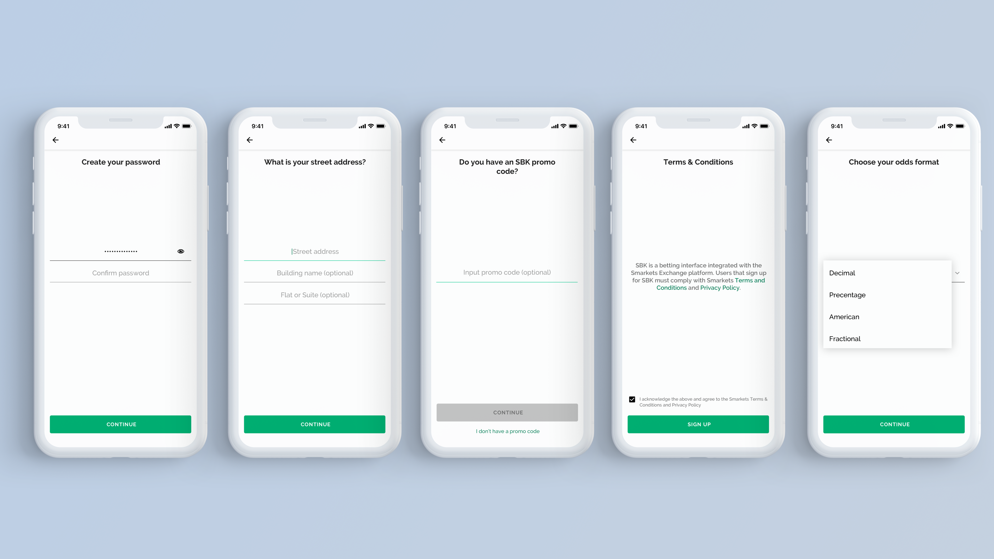
We didn't have a complete user journey for every flow, and the signup flow was one of the ones that we were missing. It was partly due to using an agency to help lay the foundational design work and not being handed over, and partly down to the speed and process in place for building the App.
Our first task was to map out this specific flow, and we noticed the number of barriers we asked users to progress through to see our App. While we couldn't say for sure that this was an issue, one thing we did know was certain things, like account validation, were happing in unexpected places. Working with the design and engineering team, we mapped out a more logical series of steps for users to pass through.
User Testing
After we felt confident in our improved signup flow, we reached out to those users who had signed up and began using that app. As well as a few who had contacted us saying they had started to signup but dropped out for various reasons. We felt this would be a good mix of users to draw insights from. In preparation for these conversations, we created a basic clickable prototype of both signup flows and recorded users actions and reactions as they went through both.
High Fidelity Designs
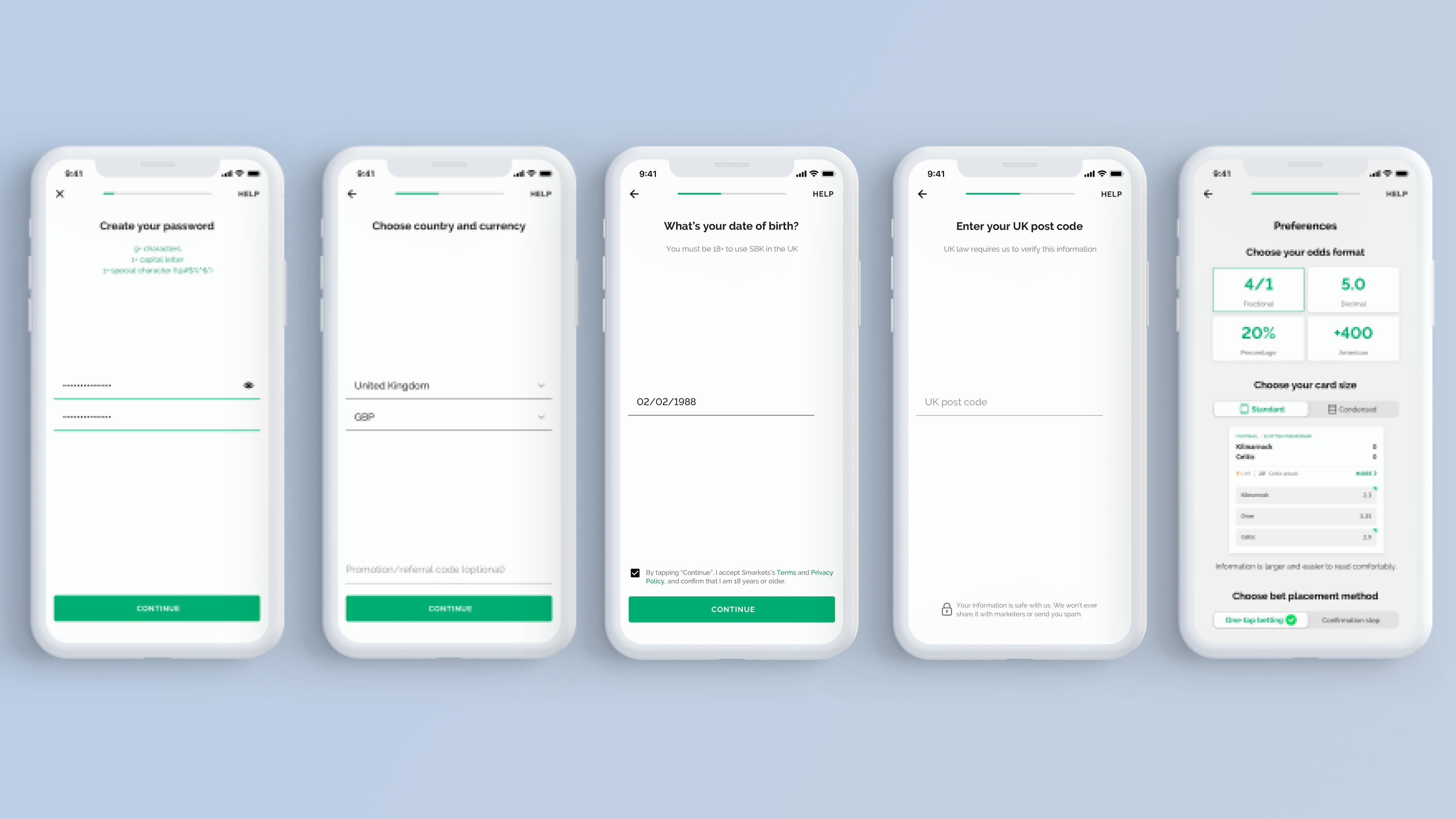
Our user testing yielded great results and allowed us to refine our flow further. We created a set of high fidelity designs implemented by the engineering team to see any failure points better. We focused on setting up our user tracking—ensuring that we had as much visibility over what a user was doing as we could, before passing this over to the marketing team to create a more visual representation. We tracked this for several weeks and made incremental changes to try and improve our conversion rate continually.
Copyright © 2021 Dean Harrison. All rights reserved.