Over the years, I’ve experimented with different ways of setting up my Figma files to highlight the different stages of a project or feature and facilitate feedback loops.
I’ve landed on a setup that I like, and to make things easier, I set up a master file that I duplicate when starting fresh. Here, I’ve set up my core pages, which act as section headers that I’ll run through below, but to set expectations, these are pretty standard.
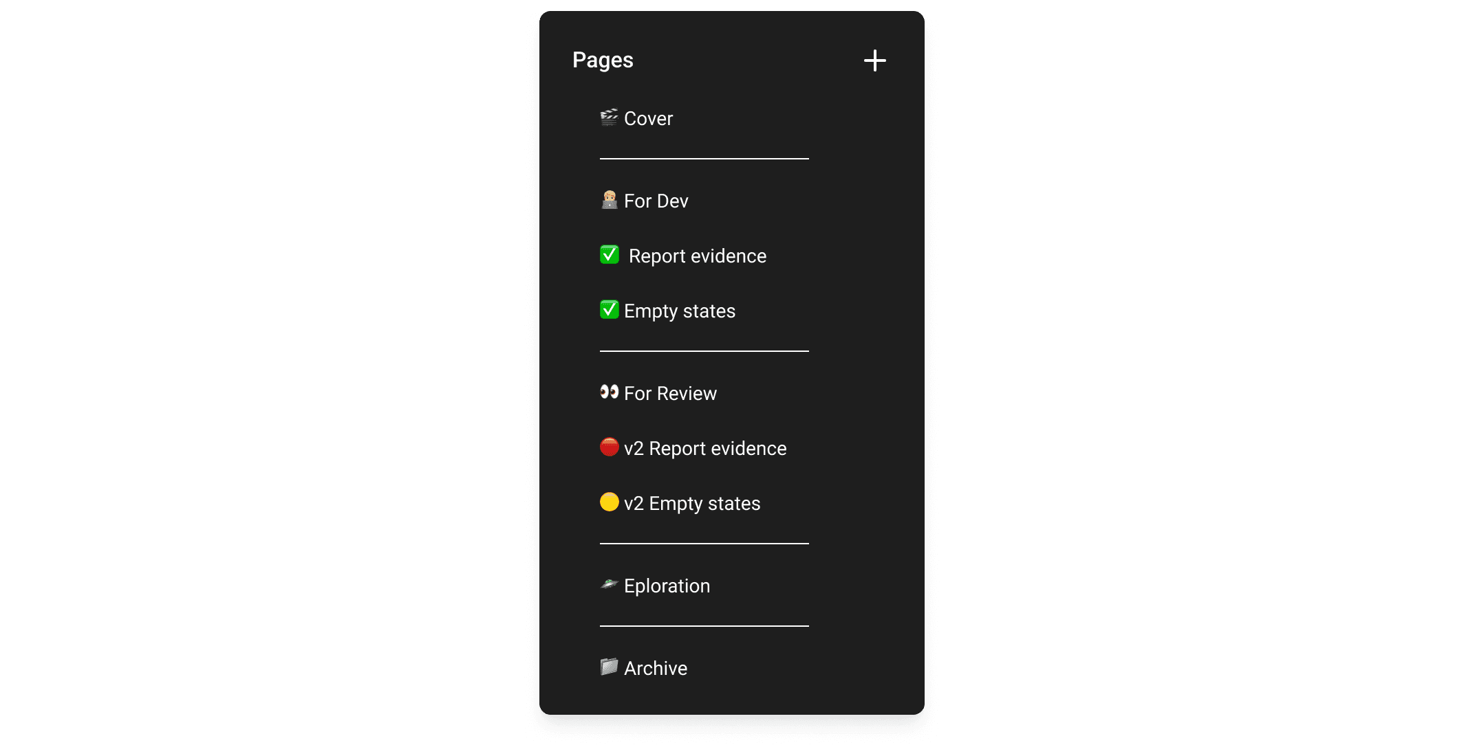
How my Figma pages looks
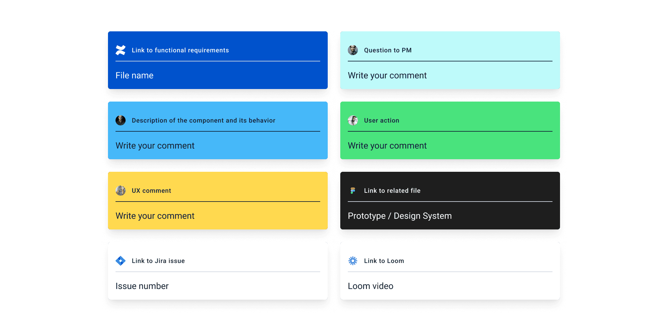
What I find helpful here is how I move work between these core pages to help those I’m working with understand where we are in a project. My template also includes a series of cards I use to link to external resources we use when working, such as Miro, Confluence and Loom.
Starting a file
I think this varies drastically depending on where I work, as it’s dictated by how the broader team wishes to organise Figma as a whole.
For me, I prefer to create a new file when I begin to work on a specific flow or feature. As an example, a share modal would be in a dedicated file, and all related updates would happen in that file.
I find this is an easy way for others to grab screens for reference and gives them a clear place to place any amended screens without causing much confusion. It requires a little bit of extra maintenance, depending on how your design system is set up.
Before I dive into how I set up my pages, let's start with what I have at the top of every file.
Cover page
It is an obvious one to start with but an important one. It includes a title that lets people know what the file contains or relates to, the product or team responsible for the work and who has contributed to the file so you know who to contact if you’ve any questions.
Depending on whether it’s a feature or a flow, I’ll include either a status (in progress, ready for dev, etc.) or version number (Version 1.0.1). The first is to indicate early what stage of the process the file is in, and the second helps should the file become too large and a new one is required so you don’t have to go hunting around pages trying to match with what is in production.
I also include an optional subtitle on the cover that can be used to give additional context or, what is the case more often than not, some nonsense follow-up to the title that isn’t funny but will elicit a groan because why not?
A recent example was Dendrogram. I choose you.
Using the sections
As mentioned, the template file contains a series of set pages I use as section headers. These headers are “For dev”, “In review”, “Exploration”, and “Archive”.
I’ll be honest, the way. I structure and work through these sections backwards, as I keep the sections/pages that are most used to those outside of design at the top so work is easy to find and they don’t get overwhelmed by the mess that can be found during ideation and iteration.
To help keep people on the right track, next to each new page I create is given an icon to denote its “readiness” status. I’ll now run through the sections in the order I would generally work in to make things a little easier to follow and show how the status plays into things.

An explanation of sections and readiness status
Exploration
Exploration is a little different to the other sections as it’s the only one I will work directly on. I do this as I want to keep all my ideation and research in one place, and I find it a lot easier to create a fresh page when preparing things for review and giving them status at that time.
Review pages
As work reaches approval or even a second set of eyes, I move it to an appropriately named page within the “In review” section. These pages are often labelled as V0.1 or V1 to show they are not final, and we’re looking for feedback.
The goal here is to lay the pages out in a manner that makes the proposal easy to follow and includes links to relevant information, such as PRD, and often a Loom video, which walks everyone through a review of what they are looking at. This can be followed up with a more official review/critique but gives those who may miss that enough context to contribute should they choose.
When a page is added to the review section, it should always start with a Red dot. This is important. The red dot is an obvious visual cue that signals to everyone that they can comment and voice an opinion on a project without derailing a team's progress. It gives those who would like to contribute a chance, and they understand that once the colour of that dot changes, any comments may only be actioned once the next iteration takes place.
For dev
A page should only be moved once the design lead and product approve it.
Even though development teams will be aware of the designs and have contributed, we want to work closely with them to clarify the undertaking. This means highlighting what components are being used, what happens during the different interactions, and anything they would like more clarity on.
We should be referencing these pages when reviewing preview builds, making it easy for the team to help with this. Once the work is pushed to production, we’ve two options: leave the screens where they are for anyone else who needs the live screens for their projects or move them to a master file that reflects the live product.
I find the latter a little hard to maintain if you’re a small team, but it is necessary for consistency in larger organisations.
Stickers that I use to annotate designs
In summary
Using your pages as a way to communicate async is paramount. They are a great way to help highlight the design process and stage gate feedback if you’re very clear about when it is possible to contribute to those outside of your direct team.
I know I’ve not gone into too many specifics on how I set up each of these pages, but I use stickers to help annotate my thoughts and link back to relevant information. I’ve picked these up from looking at how others set up their files, and I like them. They provide some extra context to those viewing the file and are great ways to help me remember what I was thinking when designing something.

