In the lead-up to the application launch, we held a series of closed and open betas to get early feedback on features and identify areas we could improve. One of the areas we identified was the signup flow. I worked closely with my team to identify what was causing problems so we could correct them.
Our goal was simple: improve new users' signup rate of ~17%. We aimed to increase by at least 50% without relying on monetary incentives. Ultimately, we achieved a completion rate of ~73% without monetary incentives and became one of the top-rated betting apps after release.
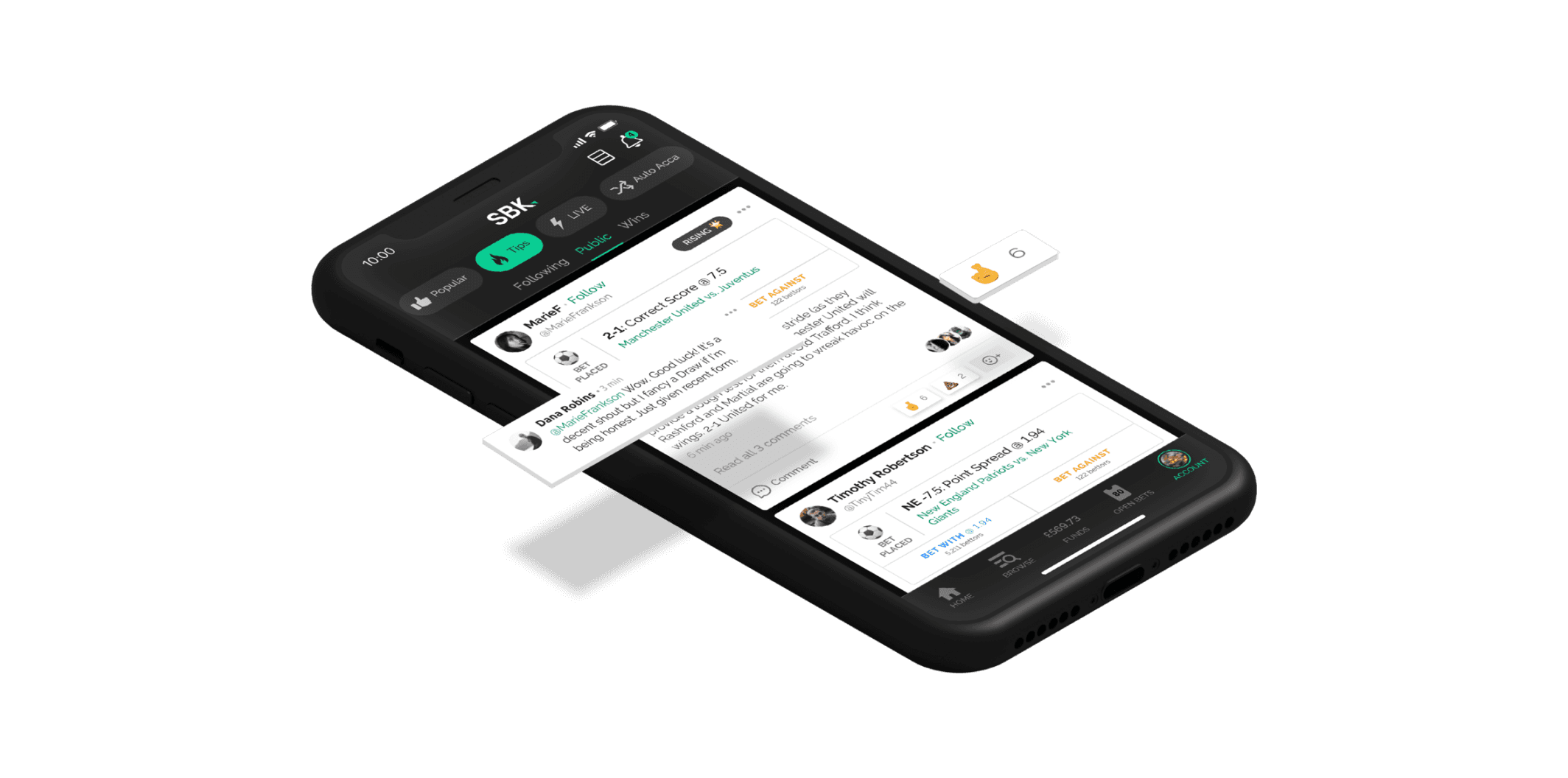
Marketing image used to promote social features
Context and Background
SBK targeted the more casual bettors, generally males aged 18 - 30 with a more familiar experience. The key selling point of SBK over its competitors was the tighter margins on the odds provided, as these were coming from the betting exchange, bolstered by robust social features allowing users to receive tips directly within the app.
In the lead-up to the launch, a queue was set up on SBK, allowing users to register interest and for us to only allow so many in at once, helping us work out any bugs as we scaled. One issue we did notice was a low completion rate for those given access of only 17%. We were confident we could solve this with a signup offer, but this was more brute force, so we decided to investigate further to see what design solutions could be found first.
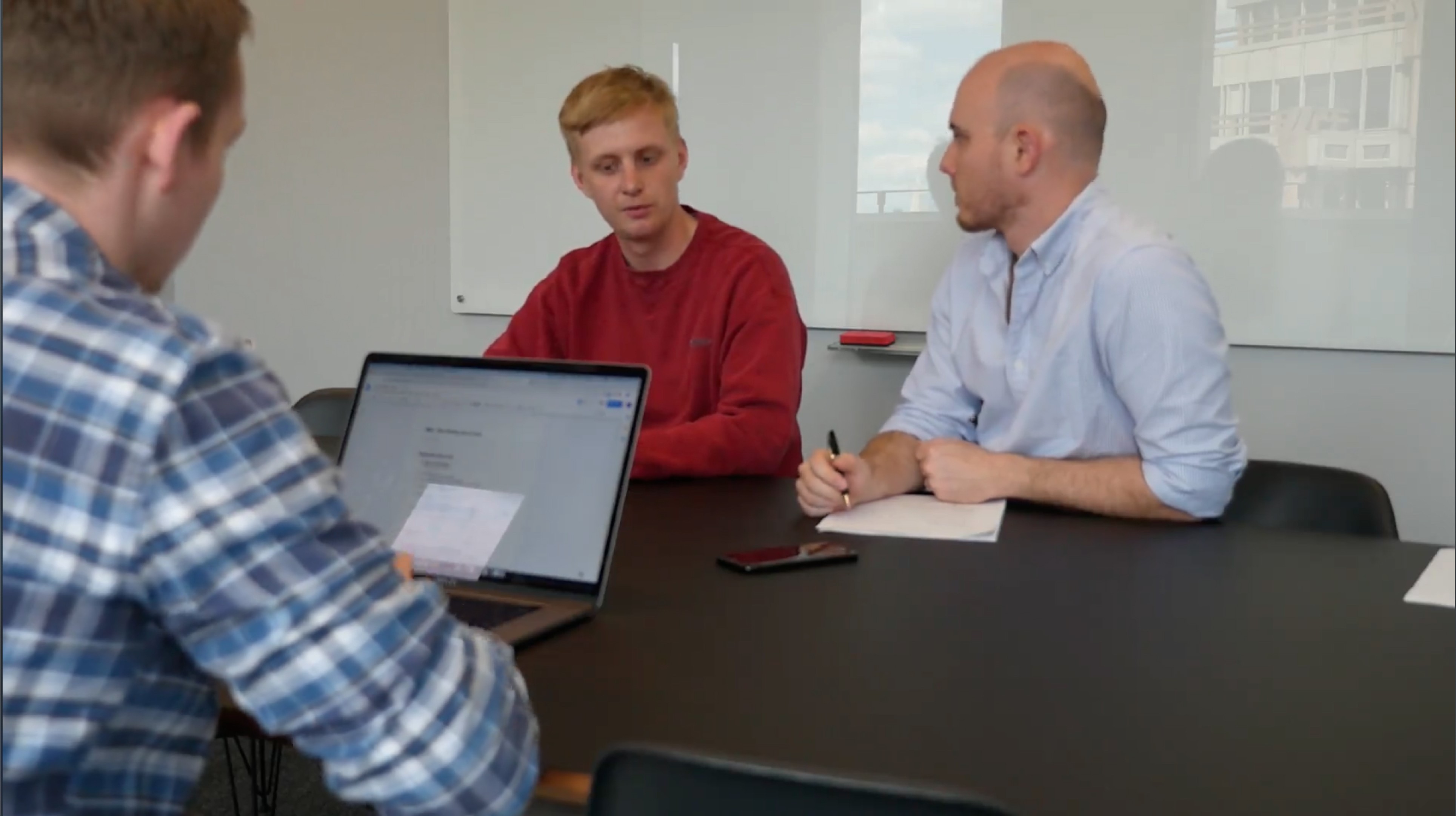
User interview we held for this project
Design Process
We aimed to keep the process lean and streamlined, as we had limited time to complete the project. First, we reviewed the existing flow by looking at our data and hotjar videos to see where users had issues, which we then highlighted on our user flow diagrams. This process highlighted some quick wins, like unclear error states and eliminating confusing screens.
As we progressed with this, we arranged several user interviews and worked closely with the development team to create a prototype that included the points we’d identified, which we used to do a split test with users, half started with the existing flow first, and the others used the amended flow first. We did this to get a balanced opinion of the flow.
It quickly became apparent which flow was preferred, and having users was also an excellent opportunity to gather more data on their habits, what competitors they used, why they used them and what they looked for in a sportsbook. We would also use this time to gather more feedback on the issues raised within the app.

Breakdown of signup flow
Conclusion
As we reviewed the interviews, it became evident that the perceived length was one of the issues with our signup flow. Our initial signup flow followed the one-question-per-screen pattern that you often see on apps like Expedia, Uber, and Duolingo, which, while only taking ~30-40 seconds to complete, felt longer and cumbersome to users, as they were more accustomed to seeing one or two screens with multiple questions.
To help manage this perception, we introduced a progress indicator and condensed screens into relevant groups where possible. For example, user settings can be done on a single screen rather than multiple. And we also decided to create a better flow for handling region-specific requirements.
These simple steps increased our completion by 41% following the release of the updates, and this steadily rose by about 30% month-on-month, all without the inclusion of a signup incentive. One metric we also tracked was the signup-to-deposit rate, which we also managed to double with our changes, achieving 44% before an offer was introduced.

